Black letter in books
In contrast to the Suetterlin script, black letter is a typeface that was used in several variations from the 16th century until about 1940. Many people possess even older books that are printed in black letter.
Get fonts here: 16 blackletter "gothic" fonts for $79 at fontcraft.com
A few handsome, free fonts can be found at: http://www.moorstation.org/typoasis/typoasis1.htm
The "blackletter typeface" Gotik, Schwabacher, and Fraktur
The "Notula" and the "Bastarda" developed from italics and were further developed variously by region. In Mainz, for example, the script developed into the "Schwabacher". Later, the stroke ends were replaced by serifs (simple break) and "Fraktur" developed..
Comparison of the alphabet in Gotik, Schwabacher, and Fraktur fonts::
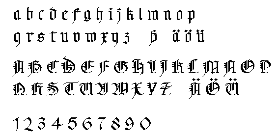
Gotik
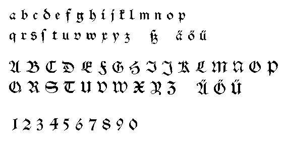
Schwabacher
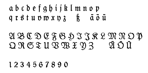
Fraktur
Try to read (is not translated):
From a cooking book of 1904
Kings order from 1751 (3 Seiten)
Funny rules for card playing from 1583
From a cooking book of 1542 (2 pages)